Anyone in business knows how important email marketing is. Your subscribers are your warm market—they’re more likely to listen, engage, and buy from you. Why not treat them well? Having a good email marketing software is key to hosting a successful email campaign or newsletter. Flodesk not only helps you create beautiful emails, it’s so easy to do and makes your email writing completely streamline!
When I first started Poised Avenue, I was using Mailchimp (for years) to house my subscribers and send newsletters out. I never loved the platform, but it was the only free option at the time. When I started to take my business more seriously, it became clear to me that free wasn’t necessarily always the best and I began looking for a better option. Here’s my take on Flodesk vs Mailchimp and why I made the switch!
I heard about Flodesk from a few friends and instantly switched—it was a no brainer. And if you’re currently using Mailchimp, you’d probably understand why if you spent even 30 seconds within Flodesk’s interface. It’s intuitive and modern, everything a business owner wants (and needs)!
Cons of Mailchimp
- Clunky
- Ugly embed options
- Requires advance design knowledge to make pretty
- Lacks nice web fonts
- Too complex/confusing of an interface
- Not intuitive
Pros of Flodesk
- Intuitive to use
- No design skills necessary to make pretty
- Easy to read analytics
- Easy to manage segments and drip campaigns
- Nice web fonts available
- Pre-designed templates
- Easy to create inviting opt-in forms
Why is Flodesk so great for business? It makes creating email newsletters that people actually want to read. That, my friends, is huge for conversion.
Think of it like this. Your subscribers are a warm market. They know you and trusted you enough with their email. Why show up in their inbox less than great? They want to hear from you, so make it worth their while.
Flodesk makes it easy to create beautiful, high-converting emails that your subscribers will actually open.

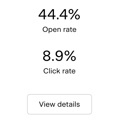
When I switched to Flodesk, my open rate went from 24.4% (the open rate of my very last email sent with Mailchimp) to 44.4% (the open rate of my last email sent out with Flodesk). Let’s put that into perspective: the average email marketing open-rate is 15-25%. Yep, Flodesk has helped me easily exceed that. Meaning, more click-throughs and therefor, more conversions.
I also noticed a huge jump in subscribers. Why? Flodesk allows you to easily create opt-in forms that are extremely easy to design, keep on brand, and embed on your website. It’s literally drag, drop, and save.
Flodesk even lets you save your custom email templates so you can use them over and over again, creating brand recognition and ease of use. You don’t need any design experience to make beautiful emails either, just scroll through their many “block” layouts to build your own template or pick one directly from their template library. It’s that easy!
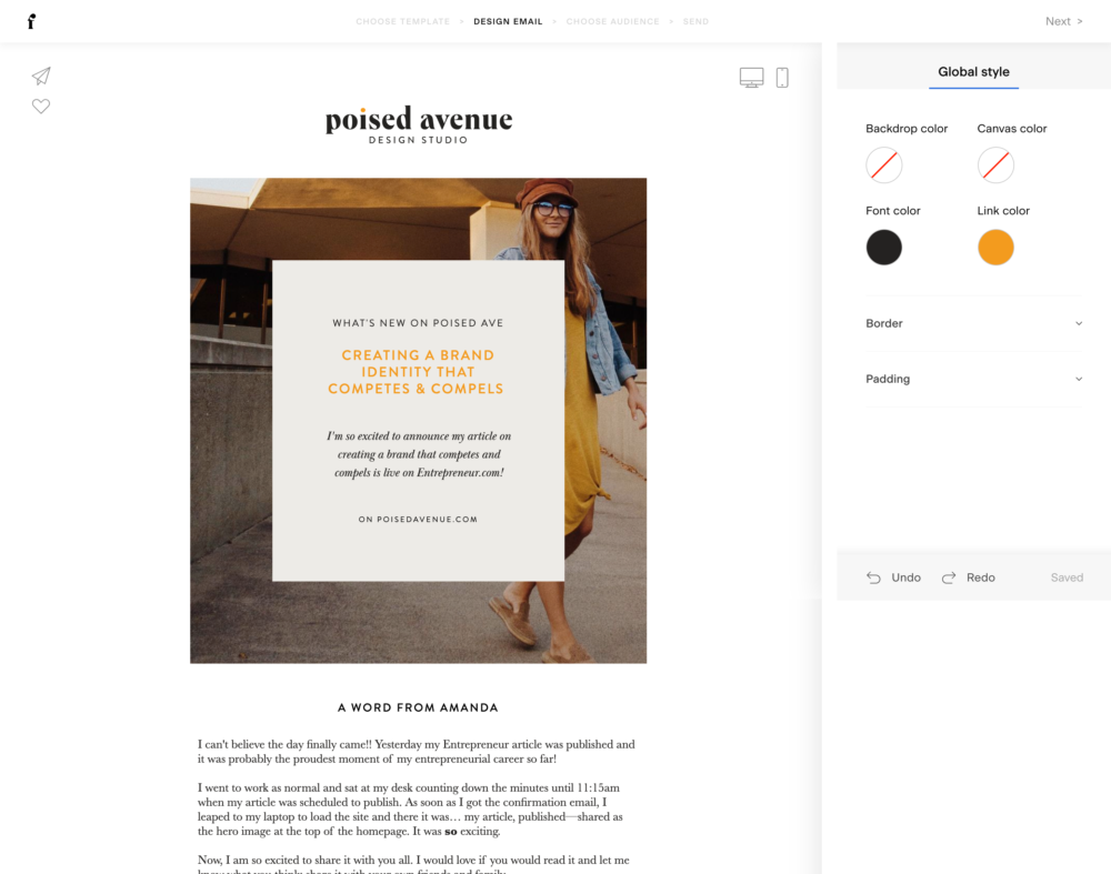
Here’s a peek into what the behind-the-scenes edit interface looks like within Flodesk:

Flodesk makes staying on brand super simple by allowing you to add your logo, brand colors, and social medias to your account. With every email, Flodesk automatically pulls your brand elements, creating beautifully on-brand emails.
So without gushing over Flodesk any more (and making this post a million words long) here is a quick recap as to why I absolutely love Flodesk and recommend it to everyone:
- Ease of use. Like, really really easy without taking away any of the user experience.
- On-brand templates/experience. As a brand designer, this one is so important to me! And I know it’s important to my clients (and you) too. Showing up in front of your audience on-brand is so important in creating trust and brand recognition… and Flodesk makes this incredibly easy.
- Price. Although it’s not free, you do get what you pay for. And with high conversion rates, it practically pays for itself. Have an affiliate link or link to your shop… maybe even a link to inquire your services? Sending those links out to your warm market (aka people who are already interested in what you have to offer) using Flodesk (aka emails that convert) means more eyes on those products/services and more click-throughs to buy. Flodesk is well worth the investment. And at only $19/month it’s extremely affordable. Click here to join for 50% off (or take advantage of 30 days free)!
- Support. Not only is there customer service amazing, but you can also join their Facebook group full of like-minded entrepreneurs and small business owners to find support.
- Easy to use workflows. Creating workflows (emails that send on a certain action) is so easy with Flodesk! Create a week of converting emails with a few clicks of your mouse and have it sent when a subscriber uses a certain opt-in form or clicks a specific button.
- They’re mobile friendly. Most people are looking at your website via their phones. That means, having opt-in forms that are mobile friendly is huge. Luckily, Flodesk’s forms are all mobile friendly, automatically.
- Organization. Flodesk makes organizing your workflows and segments easy, with color coding and everything!
- Insights. Flodesk gives you individual insights for every subscriber. Letting you know whether they view your emails on their phones or on a monitor, how many emails they’ve received, how many times they’ve opened your emails or clicked through your emails, and more. And on top of that, they give you insights into every newsletter too.
Ready to make the switch?
Get 50% off here or enjoy 30 days free before making the decision here!
Want to see Flodesk in action? Subscribe to my newsletter below!
[…] Want to read about more of my favorite resources as a business owner? Be sure to check out this post on why I went from MailChimp to Flodesk here. […]