


Grant and I were on a date a couple weeks ago when I pointed out Baskin Robbin’s new logo (I do this often… “Hey! [Insert Brand] got a new logo!” as we drive down the road haha). It’s then that I started explaining how the hidden “31” came to be updated. Grant was impressed I had noticed the 31 at all and said I’m the only one who notices those things. So… let’s test it. Which of these hidden meanings/elements have you recognized in the logos you interact with daily?
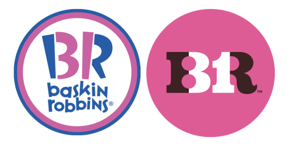
Baskin Robbin’s logo includes a hidden “31” made of the humps of the B and the stem of the R, which represents their famous “31 Flavors” tagline.
The “smiley face” is actually what creates the “g” in Goodwill.

The smile in the Amazon logo reaches from “a” to “z” to represent that they carry everything you need — from a to z.
The Quicksilver logo contains both a wave and a mountain. I had always thought this was representative of California’s terrain and sports (surfing and snowboarding) but when researching I learned the logo is also a rendition of the famous artwork The Great Wave Off Kanagawa. P.S. Ever realize that Quicksilver’s sister brand Roxy’s logo is a heart made out of two mirrored Quicksilver logos?
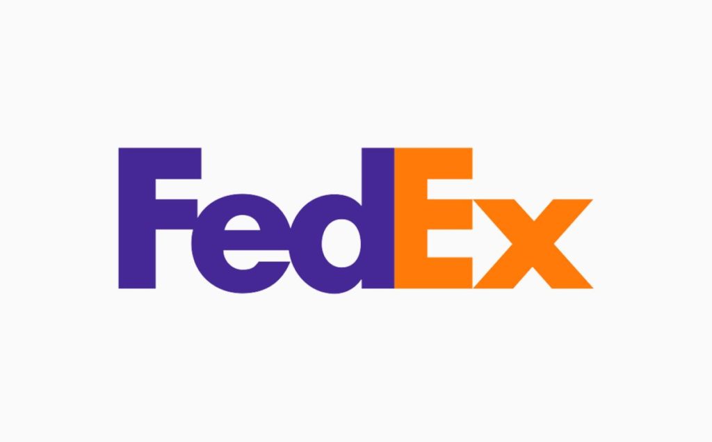
Between the “E” and “x” in FedEx’s logo, you’ll find an arrow in the negative space. It represents speed and persistence. The arrow is also an element often utilized in their branded assets.
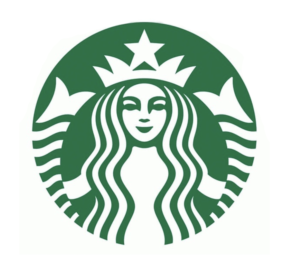
This is the only one I never noticed on my own but when researching the logos above, it popped up so I had to include it. Everything within the Starbucks logo is symmetrical… except the mermaid’s face. That’s because the designer thought creating a slightly unsymmetrical face would create a more human-like expression.
One of my favorite games when driving around town is to try to spot creative, well-designed logos… and especially logos with hidden elements or meaning. The cherry on top is always finding a logo that has been redesigned/rebranded!
Are there any logos with hidden elements/meanings that come to mind when reading this post? Drop them in the comments below!

